[ CCode ( type_id = "gtk_list_box_get_type ()" ) ]
public class ListBox : Container, Implementor, Buildable
ListBox
Object Hierarchy:
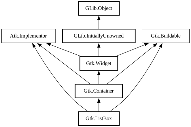
Description:
Shows a vertical list.
<picture> <source srcset="list-box-dark.png" media="(prefers-color-scheme: dark)"> <img alt="An example GtkListBox" src="list-box.png"> </picture>
A `GtkListBox` only contains `GtkListBoxRow` children. These rows can by dynamically sorted and filtered, and headers can be added dynamically depending on the row content. It also allows keyboard and mouse navigation and selection like a typical list.
Using `GtkListBox` is often an alternative to `GtkTreeView`, especially when the list contents has a more complicated layout than what is allowed by a `GtkCellRenderer`, or when the contents is interactive (i.e. has a button in it).
Although a `GtkListBox` must have only `GtkListBoxRow` children, you can add any kind of widget to it via [method@Gtk.ListBox.prepend], [ method@Gtk.ListBox.append] and [method@Gtk.ListBox.insert] and a `GtkListBoxRow` widget will automatically be inserted between the list and the widget.
`GtkListBoxRows` can be marked as activatable or selectable. If a row is activatable, [signal@Gtk.ListBox:GtkListBox:row-activated
] will be emitted for it when the user tries to activate it. If it is selectable, the row will be marked as selected when the user
tries to select it.
GtkListBox as GtkBuildable
The `GtkListBox` implementation of the `GtkBuildable` interface supports setting a child as the placeholder by specifying “placeholder” as the “type” attribute of a `<child>` element. See [method@Gtk.ListBox.set_placeholder] for info.
Shortcuts and Gestures
The following signals have default keybindings:
- [signal@Gtk.ListBox:
GtkListBox:move-cursor] - [signal@Gtk.ListBox:
GtkListBox:select-all] - [signal@Gtk.ListBox:
GtkListBox:toggle-cursor-row] - [signal@Gtk.ListBox:
GtkListBox:unselect-all]
CSS nodes
``` list.separators.navigation-sidebar ╰── row[.activatable] ```
`GtkListBox` uses a single CSS node named list. It may carry the .separators style class, when the [property@Gtk.ListBox:show-separators] property is set. Each `GtkListBoxRow` uses a single CSS node named row. The row nodes get the .activatable style class added when appropriate.
It may also carry the .boxed-list style class. In this case, the list will be automatically surrounded by a frame and have separators.
The main list node may also carry style classes to select the style of [list presentation](section-list-widget.html#list-styles): .rich-list, .navigation-sidebar or .data-table.
Accessibility
`GtkListBox` uses the [enum@Gtk.AccessibleRole.list] role and `GtkListBoxRow` uses the [enum@Gtk.AccessibleRole.list_item] role.
Namespace: Gtk
Package: gtk+-3.0
Content:
Properties:
Creation methods:
Methods:
Signals:
Inherited Members:
All known members inherited from class Gtk.Container
All known members inherited from class Gtk.Widget
All known members inherited from class GLib.Object
All known members inherited from interface Atk.Implementor
All known members inherited from interface Gtk.Buildable