Frame
Object Hierarchy:
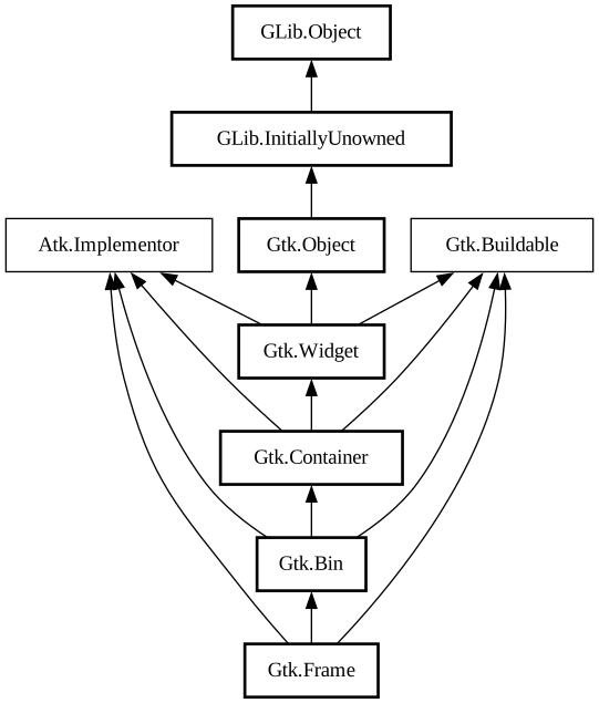
Description:
Surrounds its child with a decorative frame and an optional label.
<picture> <source srcset="frame-dark.png" media="(prefers-color-scheme: dark)"> <img alt="An example GtkFrame" src="frame.png"> </picture>
If present, the label is drawn inside the top edge of the frame. The horizontal position of the label can be controlled with [ method@Gtk.Frame.set_label_align].
`GtkFrame` clips its child. You can use this to add rounded corners to widgets, but be aware that it also cuts off shadows.
GtkFrame as GtkBuildable
An example of a UI definition fragment with GtkFrame:
```xml <object class="GtkFrame"> <property name="label-widget"> <object class="GtkLabel" id="frame_label"/> < /property> <property name="child"> <object class="GtkEntry" id="frame_content"/> </property> </object> ```
CSS nodes
``` frame ├── <label widget> ╰── <child> ```
`GtkFrame` has a main CSS node with name “frame”, which is used to draw the visible border. You can set the appearance of the border using CSS properties like “border-style” on this node.
Accessibility
`GtkFrame` uses the [enum@Gtk.AccessibleRole.group] role.
All known sub-classes:
Namespace: Gtk
Package: gtk+-2.0
Content:
Properties:
Creation methods:
Methods:
Fields:
Inherited Members:
All known members inherited from class Gtk.Bin
All known members inherited from class Gtk.Container
All known members inherited from class Gtk.Widget
All known members inherited from class Gtk.Object
All known members inherited from class GLib.Object
All known members inherited from interface Atk.Implementor
All known members inherited from interface Gtk.Buildable