- Entry
- activates_default
- buffer
- caps_lock_warning
- cursor_position
- editable
- has_frame
- im_module
- inner_border
- invisible_char
- invisible_char_set
- max_length
- overwrite_mode
- primary_icon_activatable
- primary_icon_gicon
- primary_icon_name
- primary_icon_pixbuf
- primary_icon_sensitive
- primary_icon_stock
- primary_icon_storage_type
- primary_icon_tooltip_markup
- primary_icon_tooltip_text
- progress_fraction
- progress_pulse_step
- scroll_offset
- secondary_icon_activatable
- secondary_icon_gicon
- secondary_icon_name
- secondary_icon_pixbuf
- secondary_icon_sensitive
- secondary_icon_stock
- secondary_icon_storage_type
- secondary_icon_tooltip_markup
- secondary_icon_tooltip_text
- selection_bound
- shadow_type
- text
- text_length
- truncate_multiline
- visibility
- width_chars
- xalign
- Entry
- Entry.with_buffer
- get_activates_default
- get_alignment
- get_buffer
- get_completion
- get_current_icon_drag_source
- get_cursor_hadjustment
- get_has_frame
- get_icon_activatable
- get_icon_at_pos
- get_icon_gicon
- get_icon_name
- get_icon_pixbuf
- get_icon_sensitive
- get_icon_stock
- get_icon_storage_type
- get_icon_tooltip_markup
- get_icon_tooltip_text
- get_icon_window
- get_inner_border
- get_invisible_char
- get_layout
- get_layout_offsets
- get_max_length
- get_overwrite_mode
- get_progress_fraction
- get_progress_pulse_step
- get_text
- get_text_area_size
- get_text_length
- get_text_window
- get_visibility
- get_width_chars
- im_context_filter_keypress
- layout_index_to_text_index
- progress_pulse
- reset_im_context
- set_activates_default
- set_alignment
- set_buffer
- set_completion
- set_cursor_hadjustment
- set_has_frame
- set_icon_activatable
- set_icon_drag_source
- set_icon_from_gicon
- set_icon_from_icon_name
- set_icon_from_pixbuf
- set_icon_from_stock
- set_icon_sensitive
- set_icon_tooltip_markup
- set_icon_tooltip_text
- set_inner_border
- set_invisible_char
- set_max_length
- set_overwrite_mode
- set_progress_fraction
- set_progress_pulse_step
- set_text
- set_visibility
- set_width_chars
- text_index_to_layout_index
- unset_invisible_char
- activate
- backspace
- copy_clipboard
- cut_clipboard
- delete_from_cursor
- icon_press
- icon_release
- insert_at_cursor
- move_cursor
- paste_clipboard
- populate_popup
- preedit_changed
- toggle_overwrite
- ascent
- blink_timeout
- button
- cache_includes_preedit
- cached_layout
- current_pos
- cursor_visible
- descent
- dnd_position
- drag_start_x
- drag_start_y
- editing_canceled
- im_context
- in_click
- in_drag
- is_cell_renderer
- mouse_cursor_obscured
- need_im_reset
- popup_menu
- preedit_cursor
- preedit_length
- recompute_idle
- resolved_dir
- select_lines
- select_words
- text_area
- text_max_length
- visible
- x_n_bytes
- x_text_size
Entry
Object Hierarchy:
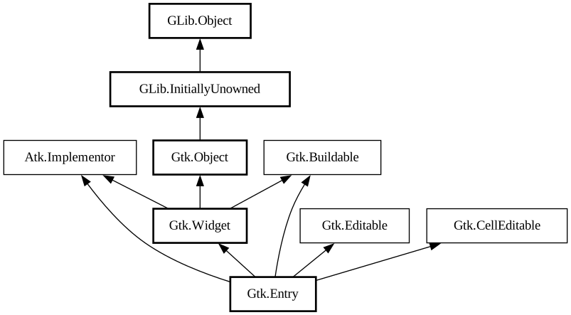
Description:
A single-line text entry widget.
<picture> <source srcset="entry-dark.png" media="(prefers-color-scheme: dark)"> <img alt="An example GtkEntry" src="entry.png"> </picture>
A fairly large set of key bindings are supported by default. If the entered text is longer than the allocation of the widget, the widget will scroll so that the cursor position is visible.
When using an entry for passwords and other sensitive information, it can be put into “password mode” using [ method@Gtk.Entry.set_visibility]. In this mode, entered text is displayed using a “invisible” character. By default, GTK picks the best invisible character that is available in the current font, but it can be changed with [method@Gtk.Entry.set_invisible_char].
`GtkEntry` has the ability to display progress or activity information behind the text. To make an entry display such information, use [ method@Gtk.Entry.set_progress_fraction] or [method@Gtk.Entry.set_progress_pulse_step].
Additionally, `GtkEntry` can show icons at either side of the entry. These icons can be activatable by clicking, can be set up as drag
source and can have tooltips. To add an icon, use [method@Gtk.Entry.set_icon_from_gicon] or one of the various other functions that set an
icon from an icon name or a paintable. To trigger an action when the user clicks an icon, connect to the [signal@Gtk.Entry:
GtkEntry:icon-presss] signal. To allow DND operations from an icon, use [method@Gtk.Entry.set_icon_drag_source]. To set a tooltip
on an icon, use [method@Gtk.Entry.set_icon_tooltip_text] or the corresponding function for markup.
Note that functionality or information that is only available by clicking on an icon in an entry may not be accessible at all to users which are not able to use a mouse or other pointing device. It is therefore recommended that any such functionality should also be available by other means, e.g. via the context menu of the entry.
CSS nodes
``` entry.flat[.error] ├── text[.readonly] ├── image.left ├── image.right ╰── [progress[.pulse]] ```
`GtkEntry` has a main node with the name entry. Depending on the properties of the entry, the style classes .read-only and .flat may appear. The style classes .warning and .error may also be used with entries.
When the entry shows icons, it adds subnodes with the name image and the style class .left or .right, depending on where the icon appears.
When the entry shows progress, it adds a subnode with the name progress. The node has the style class .pulse when the shown progress is pulsing.
For all the subnodes added to the text node in various situations, see [class@Gtk.Text].
GtkEntry as GtkBuildable
The `GtkEntry` implementation of the `GtkBuildable` interface supports a custom `<attributes>` element, which supports any number of `<attribute>` elements. The `<attribute>` element has attributes named “name“, “value“, “start“ and “end“ and allows you to specify `PangoAttribute` values for this label.
An example of a UI definition fragment specifying Pango attributes: ```xml <object class="GtkEntry"> <attributes> < attribute name="weight" value="PANGO_WEIGHT_BOLD"/> <attribute name="background" value="red" start="5" end="10"/> < /attributes> </object> ```
The start and end attributes specify the range of characters to which the Pango attribute applies. If start and end are not specified, the attribute is applied to the whole text. Note that specifying ranges does not make much sense with translatable attributes. Use markup embedded in the translatable content instead.
Accessibility
`GtkEntry` uses the [enum@Gtk.AccessibleRole.text_box] role.
All known sub-classes:
Namespace: Gtk
Package: gtk+-2.0
Content:
Properties:
- public bool activates_default { get; set; }
Whether to activate the default widget when the spin button is activated.
- public EntryBuffer buffer { get; set construct; }
The buffer object which actually stores the text.
- public bool caps_lock_warning { get; set; }
Whether password entries will show a warning when Caps Lock is on.
- public int cursor_position { get; }
- public bool editable { get; set; }
- public bool has_frame { get; set; }
Whether the entry should draw a frame.
- public string im_module { owned get; set; }
Which IM (input method) module should be used for this entry.
- public Border inner_border { get; set; }
Sets the text area's border between the text and the frame.
- public uint invisible_char { get; set; }
The character to use when masking entry contents (“password mode”) .
- public bool invisible_char_set { get; set; }
Whether the invisible char has been set for the `GtkEntry`.
- public int max_length { get; set; }
Maximum number of characters for this entry.
- public bool overwrite_mode { get; set; }
If text is overwritten when typing in the `GtkEntry`.
- public bool primary_icon_activatable { get; set; }
Whether the primary icon is activatable.
- public Icon primary_icon_gicon { owned get; set; }
The `GIcon` to use for the primary icon for the entry.
- public string primary_icon_name { owned get; set; }
The icon name to use for the primary icon for the entry.
- public Pixbuf primary_icon_pixbuf { owned get; set; }
A pixbuf to use as the primary icon for the entry.
- public bool primary_icon_sensitive { get; set; }
Whether the primary icon is sensitive.
- public string primary_icon_stock { owned get; set; }
The stock id to use for the primary icon for the entry.
- public ImageType primary_icon_storage_type { get; }
The representation which is used for the primary icon of the entry.
- public string primary_icon_tooltip_markup { owned get; set; }
The contents of the tooltip on the primary icon, with markup.
- public string primary_icon_tooltip_text { owned get; set; }
The contents of the tooltip on the primary icon.
- public double progress_fraction { get; set; }
The current fraction of the task that's been completed.
- public double progress_pulse_step { get; set; }
The fraction of total entry width to move the progress bouncing block for each pulse.
- public int scroll_offset { get; }
Number of pixels of the entry scrolled off the screen to the left.
- public bool secondary_icon_activatable { get; set; }
Whether the secondary icon is activatable.
- public Icon secondary_icon_gicon { owned get; set; }
The `GIcon` to use for the secondary icon for the entry.
- public string secondary_icon_name { owned get; set; }
The icon name to use for the secondary icon for the entry.
- public Pixbuf secondary_icon_pixbuf { owned get; set; }
An pixbuf to use as the secondary icon for the entry.
- public bool secondary_icon_sensitive { get; set; }
Whether the secondary icon is sensitive.
- public string secondary_icon_stock { owned get; set; }
The stock id to use for the secondary icon for the entry.
- public ImageType secondary_icon_storage_type { get; }
The representation which is used for the secondary icon of the entry.
- public string secondary_icon_tooltip_markup { owned get; set; }
The contents of the tooltip on the secondary icon, with markup.
- public string secondary_icon_tooltip_text { owned get; set; }
The contents of the tooltip on the secondary icon.
- public int selection_bound { get; }
- public ShadowType shadow_type { get; set; }
Which kind of shadow to draw around the entry when has_frame is set to true.
- public string text { get; set; }
- public uint text_length { get; }
The length of the text in the `GtkEntry`.
- public bool truncate_multiline { get; set; }
When true, pasted multi-line text is truncated to the first line.
- public bool visibility { get; set; }
Whether the entry should show the “invisible char” instead of the actual text (“password mode”).
- public int width_chars { get; set; }
- public float xalign { get; set; }
The horizontal alignment, from 0 (left) to 1 (right).
Creation methods:
- public Entry ()
Creates a new entry.
- public Entry.with_buffer (EntryBuffer buffer)
Creates a new entry with the specified text buffer.
Methods:
- public bool get_activates_default ()
Retrieves the value set by set_activates_default.
- public float get_alignment ()
Gets the value set by set_alignment.
- public unowned EntryBuffer get_buffer ()
Get the `GtkEntryBuffer` object which holds the text for this widget.
- public unowned EntryCompletion get_completion ()
Returns the auxiliary completion object currently in use by this.
- public int get_current_icon_drag_source ()
Returns the index of the icon which is the source of the current DND operation, or -1.
- public unowned Adjustment get_cursor_hadjustment ()
Retrieves the horizontal cursor adjustment for the entry.
- public bool get_has_frame ()
Gets the value set by set_has_frame.
- public bool get_icon_activatable (EntryIconPosition icon_pos)
Returns whether the icon is activatable.
- public int get_icon_at_pos (int x, int y)
Finds the icon at the given position and return its index.
- public unowned Icon get_icon_gicon (EntryIconPosition icon_pos)
Retrieves the `GIcon` used for the icon.
- public unowned string get_icon_name (EntryIconPosition icon_pos)
Retrieves the icon name used for the icon.
- public unowned Pixbuf get_icon_pixbuf (EntryIconPosition icon_pos)
Retrieves the image used for the icon.
- public bool get_icon_sensitive (EntryIconPosition icon_pos)
Returns whether the icon appears sensitive or insensitive.
- public unowned string get_icon_stock (EntryIconPosition icon_pos)
Retrieves the stock id used for the icon, or null if there is no icon or if the icon was set by some other method (e.
- public ImageType get_icon_storage_type (EntryIconPosition icon_pos)
Gets the type of representation being used by the icon to store image data.
- public string? get_icon_tooltip_markup (EntryIconPosition icon_pos)
Gets the contents of the tooltip on the icon at the specified position in this.
- public string? get_icon_tooltip_text (EntryIconPosition icon_pos)
Gets the contents of the tooltip on the icon at the specified position in this.
- public unowned Window get_icon_window (EntryIconPosition icon_pos)
- public unowned Border get_inner_border ()
This function returns the entry’s inner_border property.
- public unichar get_invisible_char ()
Retrieves the character displayed in place of the actual text in “password mode”.
- public unowned Layout get_layout ()
Gets the Layout used to display the entry.
- public void get_layout_offsets (out int x, out int y)
Obtains the position of the Layout used to render text in the entry, in widget coordinates.
- public int get_max_length ()
Retrieves the maximum allowed length of the text in this.
- public bool get_overwrite_mode ()
Gets whether the `GtkEntry` is in overwrite mode.
- public double get_progress_fraction ()
Returns the current fraction of the task that’s been completed.
- public double get_progress_pulse_step ()
Retrieves the pulse step set with set_progress_pulse_step.
- public unowned string get_text ()
Retrieves the contents of the entry widget.
- public virtual void get_text_area_size (out int x, out int y, out int width, out int height)
Calculate the size of the text area, which is its allocated width and requested height, minus space for margins and borders.
- public uint16 get_text_length ()
Retrieves the current length of the text in this.
- public unowned Window get_text_window ()
- public bool get_visibility ()
Retrieves whether the text in this is visible.
- public int get_width_chars ()
Gets the value set by set_width_chars.
- public bool im_context_filter_keypress (EventKey event)
Allow the Entry input method to internally handle key press and release events.
- public int layout_index_to_text_index (int layout_index)
Converts from a position in the entry’s Layout (returned by get_layout) to a position in the entry contents (returned by get_text).
- public void progress_pulse ()
Indicates that some progress is made, but you don’t know how much.
- public void reset_im_context ()
Reset the input method context of the entry if needed.
- public void set_activates_default (bool setting)
Sets whether pressing Enter in the this will activate the default widget for the window containing the entry.
- public void set_alignment (float xalign)
Sets the alignment for the contents of the entry.
- public void set_buffer (EntryBuffer buffer)
Set the `GtkEntryBuffer` object which holds the text for this widget.
- public void set_completion (EntryCompletion completion)
Sets
completionto be the auxiliary completion object to use with this. - public void set_cursor_hadjustment (Adjustment adjustment)
Hooks up an adjustment to the cursor position in an entry, so that when the cursor is moved, the adjustment is scrolled to show that position.
- public void set_has_frame (bool setting)
Sets whether the entry has a beveled frame around it.
- public void set_icon_activatable (EntryIconPosition icon_pos, bool activatable)
Sets whether the icon is activatable.
- public void set_icon_drag_source (EntryIconPosition icon_pos, TargetList target_list, DragAction actions)
Sets up the icon at the given position as drag source.
- public void set_icon_from_gicon (EntryIconPosition icon_pos, Icon? icon)
Sets the icon shown in the entry at the specified position from the current icon theme.
- public void set_icon_from_icon_name (EntryIconPosition icon_pos, string? icon_name)
Sets the icon shown in the entry at the specified position from the current icon theme.
- public void set_icon_from_pixbuf (EntryIconPosition icon_pos, Pixbuf? pixbuf)
Sets the icon shown in the specified position using a pixbuf.
- public void set_icon_from_stock (EntryIconPosition icon_pos, string? stock_id)
Sets the icon shown in the entry at the specified position from a stock image.
- public void set_icon_sensitive (EntryIconPosition icon_pos, bool sensitive)
Sets the sensitivity for the specified icon.
- public void set_icon_tooltip_markup (EntryIconPosition icon_pos, string? tooltip)
Sets
tooltipas the contents of the tooltip for the icon at the specified position. - public void set_icon_tooltip_text (EntryIconPosition icon_pos, string? tooltip)
Sets
tooltipas the contents of the tooltip for the icon at the specified position. - public void set_inner_border (Border border)
Sets entry’s inner-border property to
border, or clears it if null is passed. - public void set_invisible_char (unichar ch)
Sets the character to use in place of the actual text in “password mode”.
- public void set_max_length (int max)
Sets the maximum allowed length of the contents of the widget.
- public void set_overwrite_mode (bool overwrite)
Sets whether the text is overwritten when typing in the `GtkEntry`.
- public void set_progress_fraction (double fraction)
Causes the entry’s progress indicator to “fill in” the given fraction of the bar.
- public void set_progress_pulse_step (double fraction)
Sets the fraction of total entry width to move the progress bouncing block for each pulse.
- public void set_text (string text)
Sets the text in the widget to the given value, replacing the current contents.
- public void set_visibility (bool visible)
Sets whether the contents of the entry are visible or not.
- public void set_width_chars (int n_chars)
Changes the size request of the entry to be about the right size for
n_charscharacters. - public int text_index_to_layout_index (int text_index)
Converts from a position in the entry contents (returned by get_text) to a position in the entry’s Layout (returned by get_layout, with text retrieved via get_text).
- public void unset_invisible_char ()
Unsets the invisible char, so that the default invisible char is used again.
Signals:
- public virtual signal void activate ()
Emitted when the spin button is activated.
- public virtual signal void backspace ()
The backspace signal is a keybinding signal which gets emitted when the user asks for it.
- public virtual signal void copy_clipboard ()
The copy_clipboard signal is a keybinding signal which gets emitted to copy the selection to the clipboard.
- public virtual signal void cut_clipboard ()
The cut_clipboard signal is a keybinding signal which gets emitted to cut the selection to the clipboard.
- public virtual signal void delete_from_cursor (DeleteType type, int count)
The delete_from_cursor signal is a keybinding signal which gets emitted when the user initiates a text deletion.
- public virtual signal void icon_press (EntryIconPosition p0, Event p1)
Emitted when an activatable icon is clicked.
- public virtual signal void icon_release (EntryIconPosition p0, Event p1)
Emitted on the button release from a mouse click over an activatable icon.
- public virtual signal void insert_at_cursor (string str)
The insert_at_cursor signal is a keybinding signal which gets emitted when the user initiates the insertion of a fixed string at the cursor.
- public virtual signal void move_cursor (MovementStep step, int count, bool extend_selection)
The move_cursor signal is a keybinding signal which gets emitted when the user initiates a cursor movement.
- public virtual signal void paste_clipboard ()
The paste_clipboard signal is a keybinding signal which gets emitted to paste the contents of the clipboard into the text view.
- public virtual signal void populate_popup (Menu menu)
The populate_popup signal gets emitted before showing the context menu of the entry.
- public virtual signal void preedit_changed (string p0)
If an input method is used, the typed text will not immediately be committed to the buffer.
- public virtual signal void toggle_overwrite ()
The toggle_overwrite signal is a keybinding signal which gets emitted to toggle the overwrite mode of the entry.
Fields:
- public int ascent
- public uint blink_timeout
- public uint button
- public uint cache_includes_preedit
- public unowned Layout cached_layout
- public int current_pos
- public uint cursor_visible
- public int descent
- public int dnd_position
- public int drag_start_x
- public int drag_start_y
- public uint editing_canceled
- public unowned IMContext im_context
- public uint in_click
- public uint in_drag
- public uint is_cell_renderer
- public uint mouse_cursor_obscured
- public uint need_im_reset
- public unowned Widget popup_menu
- public uint16 preedit_cursor
- public uint16 preedit_length
- public uint recompute_idle
- public uint resolved_dir
- public uint select_lines
- public uint select_words
- public unowned Window text_area
- public uint16 text_max_length
- public uint visible
- public uint16 x_n_bytes
- public uint16 x_text_size
Inherited Members:
All known members inherited from class Gtk.Widget
- accel_closures_changed
- activate
- add_accelerator
- add_events
- add_mnemonic_label
- allocation
- app_paintable
- button_press_event
- button_release_event
- can_activate_accel
- can_default
- can_focus
- child_focus
- child_notify
- class_path
- client_event
- composite_child
- composited_changed
- configure_event
- create_pango_context
- create_pango_layout
- damage_event
- delete_event
- destroy_event
- destroyed
- direction_changed
- dispatch_child_properties_changed
- double_buffered
- drag_begin
- drag_data_delete
- drag_data_get
- drag_data_received
- drag_drop
- drag_end
- drag_failed
- drag_leave
- drag_motion
- ensure_style
- enter_notify_event
- error_bell
- event
- event_after
- events
- expose_event
- extension_events
- find_style_property
- focus
- focus_in_event
- focus_out_event
- freeze_child_notify
- get_accessible
- get_allocation
- get_ancestor
- get_app_paintable
- get_can_default
- get_can_focus
- get_child_requisition
- get_child_visible
- get_clipboard
- get_colormap
- get_composite_name
- get_default_colormap
- get_default_direction
- get_default_style
- get_default_visual
- get_direction
- get_display
- get_double_buffered
- get_events
- get_extension_events
- get_flags
- get_has_tooltip
- get_has_window
- get_mapped
- get_modifier_style
- get_no_show_all
- get_pango_context
- get_parent
- get_parent_window
- get_pointer
- get_realized
- get_receives_default
- get_requisition
- get_root_window
- get_screen
- get_sensitive
- get_settings
- get_size_request
- get_snapshot
- get_state
- get_style
- get_tooltip_markup
- get_tooltip_text
- get_tooltip_window
- get_toplevel
- get_visible
- get_visual
- get_window
- grab_broken_event
- grab_default
- grab_focus
- grab_notify
- has_default
- has_focus
- has_grab
- has_rc_style
- has_screen
- has_tooltip
- height_request
- hide
- hide_all
- hide_on_delete
- hierarchy_changed
- input_shape_combine_mask
- install_style_property
- install_style_property_parser
- intersect
- is_ancestor
- is_composited
- is_double_buffered
- is_drawable
- is_focus
- is_mapped
- is_no_window
- is_parent_sensitive
- is_rc_style
- is_realized
- is_sensitive
- is_toplevel
- key_press_event
- key_release_event
- keynav_failed
- leave_notify_event
- list_accel_closures
- list_mnemonic_labels
- list_style_properties
- map
- map_event
- mnemonic_activate
- modify_base
- modify_bg
- modify_cursor
- modify_fg
- modify_font
- modify_style
- modify_text
- motion_notify_event
- move_focus
- name
- no_expose_event
- no_show_all
- parent
- parent_set
- path
- pop_colormap
- pop_composite_child
- popup_menu
- property_notify_event
- proximity_in_event
- proximity_out_event
- push_colormap
- push_composite_child
- query_tooltip
- queue_draw
- queue_draw_area
- queue_resize
- queue_resize_no_redraw
- realize
- receives_default
- region_intersect
- remove_accelerator
- remove_mnemonic_label
- render_icon
- reparent
- requisition
- reset_rc_styles
- reset_shapes
- saved_state
- screen_changed
- scroll_event
- selection_clear_event
- selection_get
- selection_notify_event
- selection_received
- selection_request_event
- send_expose
- send_focus_change
- sensitive
- set_accel_path
- set_allocation
- set_app_paintable
- set_can_default
- set_can_focus
- set_child_visible
- set_colormap
- set_composite_name
- set_default_colormap
- set_default_direction
- set_direction
- set_double_buffered
- set_events
- set_extension_events
- set_flags
- set_has_tooltip
- set_has_window
- set_mapped
- set_no_show_all
- set_parent
- set_parent_window
- set_realized
- set_receives_default
- set_redraw_on_allocate
- set_scroll_adjustments
- set_scroll_adjustments_signal
- set_sensitive
- set_size_request
- set_state
- set_style
- set_tooltip_markup
- set_tooltip_text
- set_tooltip_window
- set_visible
- set_window
- shape_combine_mask
- show
- show_all
- show_help
- show_now
- size_allocate
- size_request
- state
- state_changed
- style
- style_attach
- style_get
- style_get_property
- style_get_valist
- style_set
- thaw_child_notify
- tooltip_markup
- tooltip_text
- translate_coordinates
- trigger_tooltip_query
- unmap
- unmap_event
- unparent
- unrealize
- unset_flags
- visibility_notify_event
- visible
- width_request
- window
- window_state_event
All known members inherited from class GLib.Object
All known members inherited from interface Atk.Implementor
All known members inherited from interface Gtk.Buildable
All known members inherited from interface Gtk.Editable
All known members inherited from interface Gtk.CellEditable