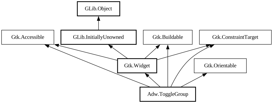
A group of exclusive toggles.
<picture> <source srcset="toggle-group-dark.png" media="(prefers-color-scheme: dark)"> <img src="toggle-group.png"
alt="toggle-group"> </picture>
`AdwToggleGroup` presents a set of exclusive toggles, represented as [class@Toggle] objects. Each toggle can display an icon, a label, an
icon and a label, or a custom child.
Toggles are indexed by their position, with the first toggle being equivalent to 0, and so on. Use the [property@ToggleGroup:active] to
get that position.
Toggles can also have optional names, set via the [property@Toggle:name] property. The name of the active toggle can be accessed via the
[property@ToggleGroup:active-name] property.
`AdwToggle` objects can be retrieved via their index or name, using [method@ToggleGroup.get_toggle] or [
method@ToggleGroup.get_toggle_by_name] respectively. `AdwToggleGroup` also provides a [iface@Gtk.SelectionModel] of its toggles via the [
property@ToggleGroup:toggles] property.
`AdwToggleGroup` is orientable, and the toggles can be displayed horizontally or vertically. This is mostly useful for icon-only toggles.
Use the [property@ToggleGroup:homogeneous] property to make the toggles take the same size, and the [property@ToggleGroup:can-shrink] to
control whether the toggles can ellipsize.
Example of an `AdwToggleGroup` UI definition:
```xml <object class="AdwToggleGroup"> <property name="active-name">picture</property> <child> <object
class="AdwToggle"> <property name="icon-name">camera-photo-symbolic</property> <property name="tooltip"
translatable="yes">Picture Mode</property> <property name="name">picture</property> </object> </child>
<child> <object class="AdwToggle"> <property name="icon-name">camera-video-symbolic</property> <property
name="tooltip" translatable="yes">Recording Mode</property> <property name="name">recording</property> </object
> </child> </object> ```
See also: [class@InlineViewSwitcher].
CSS nodes
`AdwToggleGroup` has a main CSS node with the name `toggle-group`.
Its toggles have CSS nodes with the name `toggle`, and its separators have nodes with the name `separator`.
Toggle nodes will have a different style classes depending on their content: `.text-button` for labels, `.image-button` for icons,
`.image-text-button` for both or no style class for custom children.
The hidden separators use the `.hidden` style class.
Style classes
`AdwToggleGroup` can use the [`.flat`](style-classes.html#flat_1) style class to remove its background and make it look like a group of
buttons.
<picture> <source srcset="toggle-group-flat-dark.png" media="(prefers-color-scheme: dark)"> <img
src="toggle-group-flat.png" alt="toggle-group-flat"> </picture>
It can also use the [`.round`](style-classes.html#round) style class to make its toggles and the group itself rounded.
<picture> <source srcset="toggle-group-round-dark.png" media="(prefers-color-scheme: dark)"> <img
src="toggle-group-round.png" alt="toggle-group-round"> </picture>
They can also be combined with each other.
<picture> <source srcset="toggle-group-flat-round-dark.png" media="(prefers-color-scheme: dark)"> <img
src="toggle-group-flat-round.png" alt="toggle-group-flat-round"> </picture>
Accessibility
`AdwToggleGroup` uses the [enum@Gtk.AccessibleRole.radio-group] role. Its toggles use the [enum@Gtk.AccessibleRole.radio] role.