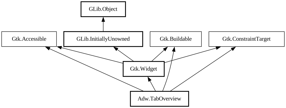
A tab overview for [class@TabView].
<picture> <source srcset="tab-overview-dark.png" media="(prefers-color-scheme: dark)"> <img src="tab-overview.png"
alt="tab-overview"> </picture>
`AdwTabOverview` is a widget that can display tabs from an `AdwTabView` in a grid.
`AdwTabOverview` shows a thumbnail for each tab. By default thumbnails are static for all pages except the selected one. They can be made
always live by setting [property@TabPage:live-thumbnail] to `TRUE`, or refreshed with [method@TabPage.invalidate_thumbnail] or [
method@TabView.invalidate_thumbnails] otherwise.
If the pages are too tall or too wide, the thumbnails will be cropped; use [property@TabPage:thumbnail-xalign] and [
property@TabPage:thumbnail-yalign] to control which part of the page should be visible in this case.
Pinned tabs are shown as smaller cards without thumbnails above the other tabs. Unlike in [class@TabBar], they still have titles, as well
as an unpin button.
`AdwTabOverview` provides search in open tabs. It searches in tab titles and tooltips, as well as [property@TabPage:keyword].
If [property@TabOverview:enable-new-tab] is set to `TRUE`, a new tab button will be shown. Connect to the [signal@TabOverview:
AdwTabOverview:create-tab] signal to use it.
[property@TabOverview:secondary-menu] can be used to provide a secondary menu for the overview. Use it to add extra actions, e.g. to open
a new window or undo closed tab.
`AdwTabOverview` is intended to be used as the direct child of the window, with the rest of the window contents set as the [
property@TabOverview:child]. The child is expected to contain an [class@TabView].
`AdwTabOverview` shows window buttons by default. They can be disabled by setting [property@TabOverview:show-start-title-buttons] and/or
[property@TabOverview:show-start-title-buttons] and/or [property@TabOverview:show-end-title-buttons] to `FALSE`.
If search and window buttons are disabled, and secondary menu is not set, the header bar will be hidden.
Drag-and-Drop
`AdwTabOverview` thumbnails can have an additional drop target for arbitrary content.
Use [method@TabOverview.setup_extra_drop_target] to set it up, specifying the supported content types and drag actions, then connect to [
signal@TabOverview:AdwTabOverview:extra-drag-drop] to handle a drop.
In some cases, it may be necessary to determine the used action based on the content. In that case, set [
property@TabOverview:extra-drag-preload] to `TRUE` and connect to [signal@TabOverview:AdwTabOverview:extra-drag-value]
signal, then return the action from its handler. To access this action from the [signal@TabOverview:AdwTabOverview:extra-drag-drop
] handler, use the [property@TabOverview:extra-drag-preferred-action] property.
[signal@TabOverview:AdwTabOverview:extra-drag-value] is also always emitted when starting to hover an item, with a `NULL`
value. This happens even when [property@TabOverview:extra-drag-preload] is `FALSE`.
Actions
`AdwTabOverview` defines the `overview.open` and `overview.close` actions for opening and closing itself. They can be convenient when
used together with [class@TabButton].
CSS nodes
`AdwTabOverview` has a single CSS node with name `taboverview`.