[ CCode ( type_id = "adap_combo_row_get_type ()" ) ]
public class ComboRow : ActionRow, Accessible, Actionable, Buildable, ConstraintTarget
ComboRow
Object Hierarchy:
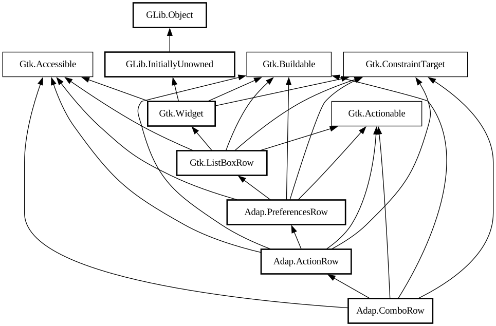
Description:
A [class@Gtk.
ListBoxRow] used to choose from a list of items.
<picture> <source srcset="combo-row-dark.png" media="(prefers-color-scheme: dark)"> <img src="combo-row.png" alt="combo-row"> </picture>
The `AdapComboRow` widget allows the user to choose from a list of valid choices. The row displays the selected choice. When activated, the row displays a popover which allows the user to make a new choice.
Example of an `AdapComboRow` UI definition: ```xml <object class="AdapComboRow"> <property name="title" translatable="yes"> Combo Row</property> <property name="model"> <object class="GtkStringList"> <items> <item translatable="yes">Foo</item> <item translatable="yes">Bar</item> <item translatable="yes">Baz</item> </items> </object> </property> </object> ```
The [property@ComboRow:selected] and [property@ComboRow:selected-item] properties can be used to keep track of the selected item and react to their changes.
`AdapComboRow` mirrors [class@Gtk.DropDown], see that widget for details.
`AdapComboRow` is [property@Gtk.ListBoxRow:activatable] if a model is set.
CSS nodes
`AdapComboRow` has a main CSS node with name `row` and the `.combo` style class.
Its popover has the node named `popover` with the `.menu` style class, it contains a [class@Gtk.ScrolledWindow], which in turn contains a [class@Gtk.ListView], both are accessible via their regular nodes.
Accessibility
`AdapComboRow` uses the `GTK_ACCESSIBLE_ROLE_COMBO_BOX` role.
Namespace: Adap
Package: libadapta-1
Content:
Properties:
Creation methods:
Methods:
Inherited Members:
All known members inherited from class Adap.ActionRow
All known members inherited from class Adap.PreferencesRow
All known members inherited from class Gtk.ListBoxRow
All known members inherited from class Gtk.Widget
All known members inherited from class GLib.Object
All known members inherited from interface Gtk.Accessible
All known members inherited from interface Gtk.Actionable
All known members inherited from interface Gtk.Buildable