[ CCode ( type_id = "adap_action_row_get_type ()" ) ]
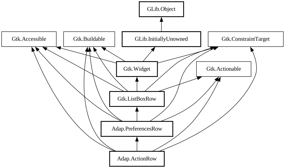
public class ActionRow : PreferencesRow, Accessible, Actionable, Buildable, ConstraintTarget
ActionRow
Object Hierarchy:
Description:
A [class@Gtk.
ListBoxRow] used to present actions.
<picture> <source srcset="action-row-dark.png" media="(prefers-color-scheme: dark)"> <img src="action-row.png" alt="action-row"> </picture>
The `AdapActionRow` widget can have a title, a subtitle and an icon. The row can receive additional widgets at its end, or prefix widgets at its start.
It is convenient to present a preference and its related actions.
`AdapActionRow` is unactivatable by default, giving it an activatable widget will automatically make it activatable, but unsetting it won't change the row's activatability.
AdapActionRow as GtkBuildable
The `AdapActionRow` implementation of the [iface@Gtk.Buildable] interface supports adding a child at its end by specifying “suffix” or omitting the “type” attribute of a <child> element.
It also supports adding a child as a prefix widget by specifying “prefix” as the “type” attribute of a <child> element.
CSS nodes
`AdapActionRow` has a main CSS node with name `row`.
It contains the subnode `box.header` for its main horizontal box, and `box.title` for the vertical box containing the title and subtitle labels.
It contains subnodes `label.title` and `label.subtitle` representing respectively the title label and subtitle label.
`AdapActionRow` can use the [`.property`](style-classes.html#property-rows) style class to emphasize the row subtitle instead of the row title, which is useful for displaying read-only properties.
All known sub-classes:
Namespace: Adap
Package: libadapta-1
Content:
Properties:
Creation methods:
Methods:
Signals:
Inherited Members:
All known members inherited from class Adap.PreferencesRow
All known members inherited from class Gtk.ListBoxRow
All known members inherited from class Gtk.Widget
All known members inherited from class GLib.Object
All known members inherited from interface Gtk.Accessible
All known members inherited from interface Gtk.Actionable
All known members inherited from interface Gtk.Buildable