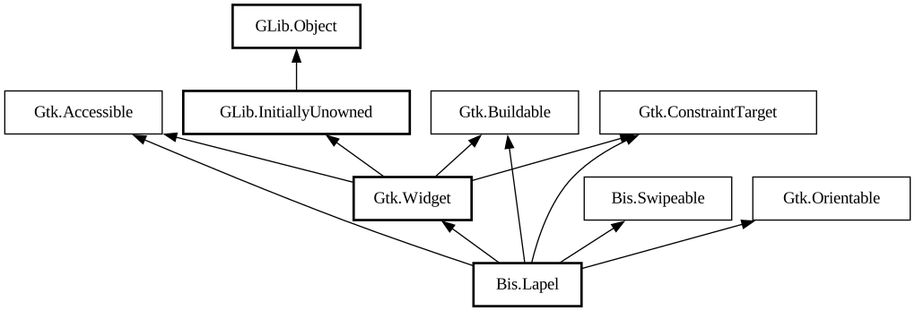
An adaptive container acting like a box or an overlay.
<picture> <source srcset="lapel-wide-dark.png" media="(prefers-color-scheme: dark)"> <img src="lapel-wide.png"
alt="lapel-wide"> </picture> <picture> <source srcset="lapel-narrow-dark.png" media="(prefers-color-scheme: dark)">
<img src="lapel-narrow.png" alt="lapel-narrow"> </picture>
The `BisLapel` widget can display its children like a [class@Gtk.Box] does or like a [class@Gtk.Overlay] does, according to the [
property@Lapel:fold-policy] value.
`BisLapel` has at most three children: [property@Lapel:content], [property@Lapel:lapel] and [property@Lapel:separator]. Content is the
primary child, lapel is displayed next to it when unfolded, or overlays it when folded. Lapel can be shown or hidden by changing the [
property@Lapel:reveal-lapel] value, as well as via swipe gestures if [property@Lapel:swipe-to-open] and/or [property@Lapel:swipe-to-close]
are set to `TRUE`.
Optionally, a separator can be provided, which would be displayed between the content and the lapel when there's no shadow to separate
them, depending on the transition type.
[property@Lapel:lapel] is transparent by default; add the [`.background`](style-classes.html#background) style class to it if this is
unwanted.
If [property@Lapel:modal] is set to `TRUE`, content becomes completely inaccessible when the lapel is revealed while folded.
The position of the lapel and separator children relative to the content is determined by orientation, as well as the [
property@Lapel:lapel-position] value.
Folding the lapel will automatically hide the lapel widget, and unfolding it will automatically reveal it. If this behavior is not
desired, the [property@Lapel:locked] property can be used to override it.
Common use cases include sidebars, header bars that need to be able to overlap the window content (for example, in fullscreen mode) and
bottom sheets.
BisLapel as GtkBuildable
The `BisLapel` implementation of the [iface@Gtk.Buildable] interface supports setting the lapel child by specifying “lapel” as the
“type” attribute of a `<child>` element, and separator by specifying “separator”. Specifying “content” child type or
omitting it results in setting the content child.
CSS nodes
`BisLapel` has a single CSS node with name `lapel`. The node will get the style classes `.folded` when it is folded, and `.unfolded` when
it's not.