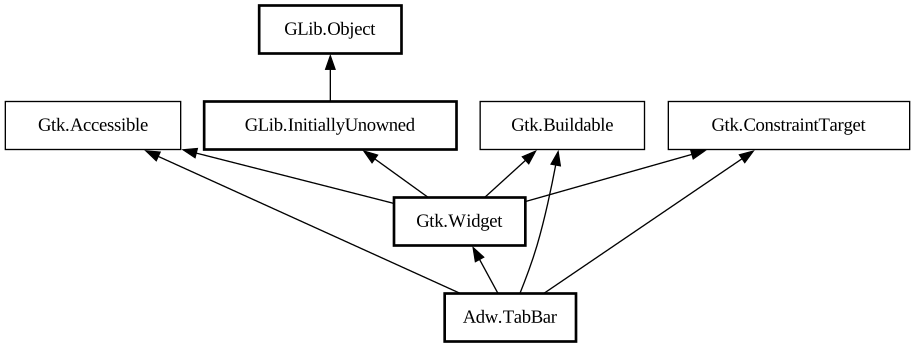
A tab bar for [class@TabView].
<picture> <source srcset="tab-bar-dark.png" media="(prefers-color-scheme: dark)"> <img src="tab-bar.png" alt="tab-bar"
> </picture>
The `AdwTabBar` widget is a tab bar that can be used with conjunction with `AdwTabView`. It is typically used as a top bar within [
class@ToolbarView].
`AdwTabBar` can autohide and can optionally contain action widgets on both sides of the tabs.
When there's not enough space to show all the tabs, `AdwTabBar` will scroll them. Pinned tabs always stay visible and aren't a part of
the scrollable area.
Drag-and-Drop
`AdwTabBar` tabs can have an additional drop target for arbitrary content.
Use [method@TabBar.setup_extra_drop_target] to set it up, specifying the supported content types and drag actions, then connect to [
signal@TabBar:AdwTabBar:extra-drag-drop] to handle a drop.
In some cases, it may be necessary to determine the used action based on the content. In that case, set [
property@TabBar:extra-drag-preload] to `TRUE` and connect to [signal@TabBar:AdwTabBar:extra-drag-value] signal, then return
the action from its handler. To access this action from the [signal@TabBar:AdwTabBar:extra-drag-drop] handler, use the [
property@TabBar:extra-drag-preferred-action] property.
[signal@TabBar:AdwTabBar:extra-drag-value] is also always emitted when starting to hover an item, with a `NULL` value. This
happens even when [property@TabBar:extra-drag-preload] is `FALSE`.
CSS nodes
`AdwTabBar` has a single CSS node with name `tabbar`.
Style classes
By default `AdwTabBar` look like a part of an `AdwHeaderBar` and is intended to be used directly attached to one or used as a [
class@ToolbarView] toolbar. The [`.inline`](style-classes.html#inline) style class removes its background, so that it can be used in
different contexts instead.
<picture> <source srcset="tab-bar-inline-dark.png" media="(prefers-color-scheme: dark)"> <img src="tab-bar-inline.png"
alt="tab-bar-inline"> </picture>