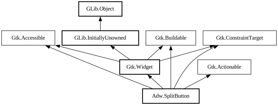
- action_set_enabled
- activate
- activate_action
- activate_action_variant
- activate_default
- add_binding
- add_binding_action
- add_binding_signal
- add_controller
- add_css_class
- add_mnemonic_label
- add_shortcut
- add_tick_callback
- allocate
- allocate_size
- bind_template_callback_full
- bind_template_child_full
- can_focus
- can_target
- child_focus
- compute_bounds
- compute_expand
- compute_expand_internal
- compute_point
- compute_transform
- contains
- create_pango_context
- create_pango_layout
- css_changed
- css_classes
- css_name
- cursor
- destroy
- direction_changed
- dispose_template
- error_bell
- focus
- focus_on_click
- focusable
- get_accessible_role
- get_activate_signal
- get_allocated_baseline
- get_allocated_height
- get_allocated_width
- get_allocation
- get_ancestor
- get_baseline
- get_can_focus
- get_can_target
- get_child_visible
- get_clipboard
- get_color
- get_css_classes
- get_css_name
- get_cursor
- get_default_direction
- get_direction
- get_display
- get_first_child
- get_focus_child
- get_focus_on_click
- get_focusable
- get_font_map
- get_font_options
- get_frame_clock
- get_halign
- get_has_tooltip
- get_height
- get_hexpand
- get_hexpand_set
- get_last_child
- get_layout_manager
- get_layout_manager_type
- get_limit_events
- get_mapped
- get_margin_bottom
- get_margin_end
- get_margin_start
- get_margin_top
- get_name
- get_native
- get_next_sibling
- get_opacity
- get_overflow
- get_pango_context
- get_parent
- get_preferred_size
- get_prev_sibling
- get_primary_clipboard
- get_realized
- get_receives_default
- get_request_mode
- get_root
- get_scale_factor
- get_sensitive
- get_settings
- get_size
- get_size_request
- get_state_flags
- get_style_context
- get_template_child
- get_tooltip_markup
- get_tooltip_text
- get_valign
- get_vexpand
- get_vexpand_set
- get_visible
- get_width
- grab_focus
- halign
- has_css_class
- has_default
- has_focus
- has_tooltip
- has_visible_focus
- height_request
- hexpand
- hexpand_set
- hide
- in_destruction
- init_template
- insert_action_group
- insert_after
- insert_before
- install_action
- install_property_action
- is_ancestor
- is_drawable
- is_focus
- is_sensitive
- is_visible
- keynav_failed
- layout_manager
- limit_events
- list_mnemonic_labels
- map
- margin_bottom
- margin_end
- margin_start
- margin_top
- measure
- mnemonic_activate
- move_focus
- name
- observe_children
- observe_controllers
- opacity
- overflow
- parent
- pick
- query_action
- query_tooltip
- queue_allocate
- queue_draw
- queue_resize
- realize
- receives_default
- remove_controller
- remove_css_class
- remove_mnemonic_label
- remove_tick_callback
- root
- scale_factor
- sensitive
- set_accessible_role
- set_activate_signal
- set_activate_signal_from_name
- set_can_focus
- set_can_target
- set_child_visible
- set_css_classes
- set_css_name
- set_cursor
- set_cursor_from_name
- set_default_direction
- set_direction
- set_focus_child
- set_focus_on_click
- set_focusable
- set_font_map
- set_font_options
- set_halign
- set_has_tooltip
- set_hexpand
- set_hexpand_set
- set_layout_manager
- set_layout_manager_type
- set_limit_events
- set_margin_bottom
- set_margin_end
- set_margin_start
- set_margin_top
- set_name
- set_opacity
- set_overflow
- set_parent
- set_receives_default
- set_sensitive
- set_size_request
- set_state_flags
- set_template
- set_template_from_resource
- set_template_scope
- set_tooltip_markup
- set_tooltip_text
- set_valign
- set_vexpand
- set_vexpand_set
- set_visible
- should_layout
- show
- size_allocate
- snapshot
- snapshot_child
- state_flags_changed
- system_setting_changed
- tooltip_markup
- tooltip_text
- translate_coordinates
- trigger_tooltip_query
- unmap
- unparent
- unrealize
- unroot
- unset_state_flags
- valign
- vexpand
- vexpand_set
- visible
- width_request