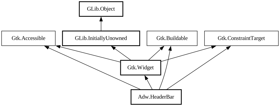
A title bar widget.
<picture> <source srcset="header-bar-dark.png" media="(prefers-color-scheme: dark)"> <img src="header-bar.png"
alt="header-bar"> </picture>
`AdwHeaderBar` is similar to [class@Gtk.HeaderBar], but provides additional features compared to it. Refer to `GtkHeaderBar` for details.
It is typically used as a top bar within [class@ToolbarView].
Dialog Integration
When placed inside an [class@Dialog], `AdwHeaderBar` will display the dialog title instead of window title. It will also adjust the
decoration layout to ensure it always has a close button and nothing else. Set [property@HeaderBar:show-start-title-buttons] and [
property@HeaderBar:show-end-title-buttons] to `FALSE` to remove it if it's unwanted.
Navigation View Integration
When placed inside an [class@NavigationPage], `AdwHeaderBar` will display the page title instead of window title.
When used together with [class@NavigationView] or [class@NavigationSplitView], it will also display a back button that can be used to go
back to the previous page. The button also has a context menu, allowing to pop multiple pages at once, potentially across multiple
navigation views.
Set [property@HeaderBar:show-back-button] to `FALSE` to disable this behavior in rare scenarios where it's unwanted.
Split View Integration
When placed inside [class@NavigationSplitView] or [class@OverlaySplitView], `AdwHeaderBar` will automatically hide the title buttons
other than at the edges of the window.
Bottom Sheet Integration
When played inside [class@BottomSheet], `AdwHeaderBar` will not show the title unless [property@BottomSheet:show-drag-handle] is set to
`FALSE`, regardless of [property@HeaderBar:show-title]. This only applies to the default title, titles set with [
property@HeaderBar:title-widget] will still be shown.
Centering Policy
[property@HeaderBar:centering-policy] allows to enforce strict centering of the title widget. This can be useful for entries inside [
class@Clamp].
Title Buttons
Unlike `GtkHeaderBar`, `AdwHeaderBar` allows to toggle title button visibility for each side individually, using the [
property@HeaderBar:show-start-title-buttons] and [property@HeaderBar:show-end-title-buttons] properties.
CSS nodes
``` headerbar ╰── windowhandle ╰── box ├── widget │ ╰── box.start │ ├── windowcontrols.start │
├── widget │ │ ╰── [button.back] │ ╰── [other children] ├── widget │ ╰── [Title Widget]
╰── widget ╰── box.end ├── [other children] ╰── windowcontrols.end ```
`AdwHeaderBar`'s CSS node is called `headerbar`. It contains a `windowhandle` subnode, which contains a `box` subnode, which contains
three `widget` subnodes at the start, center and end of the header bar. The start and end subnodes contain a `box` subnode with the
`.start` and `.end` style classes respectively, and the center node contains a node that represents the title.
Each of the boxes contains a `windowcontrols` subnode, see [class@Gtk.WindowControls] for details, as well as other children.
When [property@HeaderBar:show-back-button] is `TRUE`, the start box also contains a node with the name `widget` that contains a node with
the name `button` and `.back` style class.
Accessibility
`AdwHeaderBar` uses the [enum@Gtk.AccessibleRole.group] role.