[ CCode ( type_id = "adw_button_row_get_type ()" ) ]
[ Version ( since = "1.6" ) ]
public sealed class ButtonRow : PreferencesRow, Accessible, Actionable, Buildable, ConstraintTarget
ButtonRow
Object Hierarchy:
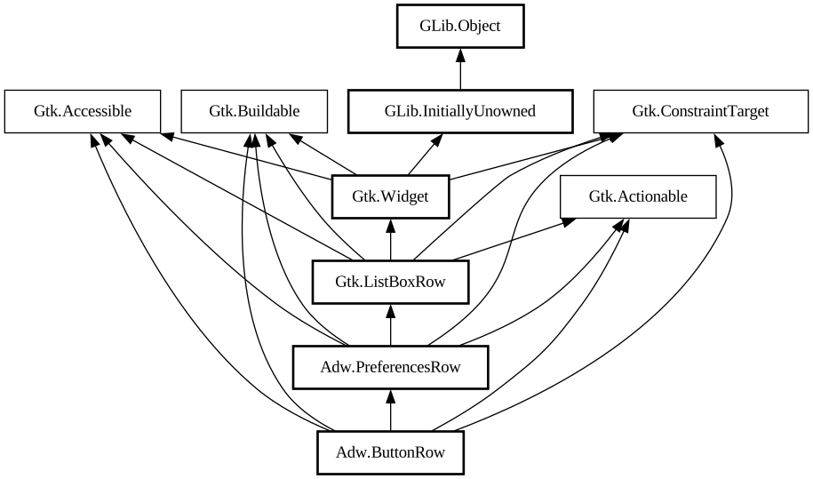
Description:
A [class@Gtk.
ListBoxRow] that looks like a button.
<picture> <source srcset="button-rows-dark.png" media="(prefers-color-scheme: dark)"> <img src="button-rows.png" alt="button-rows"> </picture>
The `AdwButtonRow` widget has a title and two icons: before and after the title.
It is convenient for presenting actions like "Delete" at the end of a boxed list.
`AdwButtonRow` is always activatable.
CSS nodes
`AdwButtonRow` has a main CSS node with name `row` and the style class `.button`.
It contains the subnode `box` for its main horizontal box, which contains the nodes: `image.icon.start` for the start icon, `label.title` for the title, and `image.icon.end` for the end icon.
Style classes
The [`.suggested-action`](style-classes.html#suggested-action) style class makes `AdwButtonRow` use accent color for its background. It should be used very sparingly to denote important buttons.
<picture> <source srcset="button-row-suggested-action-dark.png" media="(prefers-color-scheme: dark)"> <img src="button-row-suggested-action.png" alt="button-row-suggested-action"> </picture>
The [`.destructive-action`](style-classes.html#destructive-action) style makes the row use destructive colors. It can be used to draw attention to the potentially damaging consequences of using it. This style acts as a warning to the user.
<picture> <source srcset="button-row-destructive-action-dark.png" media="(prefers-color-scheme: dark)"> <img src="button-row-destructive-action.png" alt="button-row-destructive-action"> </picture>
Namespace: Adw
Package: libadwaita-1
Content:
Properties:
Creation methods:
Methods:
Signals:
Inherited Members:
All known members inherited from class Adw.PreferencesRow
All known members inherited from class Gtk.ListBoxRow
All known members inherited from class Gtk.Widget
All known members inherited from class GLib.Object
All known members inherited from interface Gtk.Accessible
All known members inherited from interface Gtk.Actionable
All known members inherited from interface Gtk.Buildable