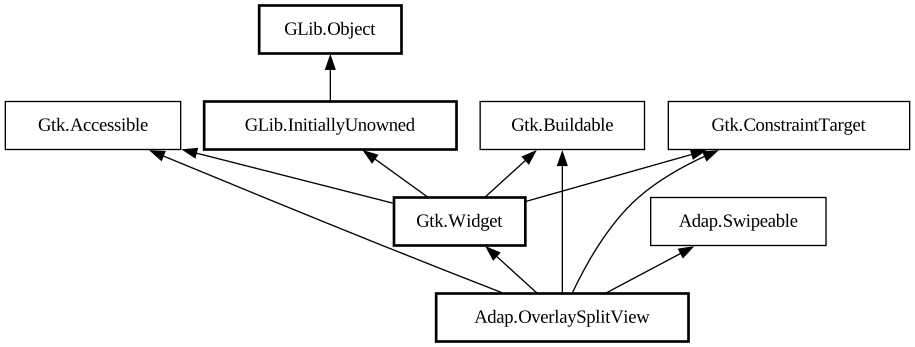
A widget presenting sidebar and content side by side or as an overlay.
<picture> <source srcset="overlay-split-view-dark.png" media="(prefers-color-scheme: dark)"> <img
src="overlay-split-view.png" alt="overlay-split-view"> </picture> <picture> <source
srcset="overlay-split-view-collapsed-dark.png" media="(prefers-color-scheme: dark)"> <img src="overlay-split-view-collapsed.png"
alt="overlay-split-view-collapsed"> </picture>
`AdapOverlaySplitView` has two children: sidebar and content, and displays them side by side.
When [property@OverlaySplitView:collapsed] is set to `TRUE`, the sidebar is instead shown as an overlay above the content widget.
The sidebar can be hidden or shown using the [property@OverlaySplitView:show-sidebar] property.
Sidebar can be displayed before or after the content, this can be controlled with the [property@OverlaySplitView:sidebar-position]
property.
Collapsing the split view automatically hides the sidebar widget, and uncollapsing it shows the sidebar. If this behavior is not desired,
the [property@OverlaySplitView:pin-sidebar] property can be used to override it.
`AdapOverlaySplitView` supports an edge swipe gesture for showing the sidebar, and a swipe from the sidebar for hiding it. Gestures are
only supported on touchscreen, but not touchpad. Gestures can be controlled with the [property@OverlaySplitView:enable-show-gesture] and [
property@OverlaySplitView:enable-hide-gesture] properties.
See also [class@NavigationSplitView].
`AdapOverlaySplitView` is typically used together with an [class@Breakpoint] setting the `collapsed` property to `TRUE` on small widths,
as follows:
```xml <object class="AdapWindow"> <property name="width-request">360</property> <property name="height-request"
>200</property> <property name="default-width">800</property> <property name="default-height">800<
/property> <child> <object class="AdapBreakpoint"> <condition>max-width: 400sp</condition> <setter
object="split_view" property="collapsed">True</setter> </object> </child> <property name="content"> <
object class="AdapOverlaySplitView" id="split_view"> <property name="sidebar"> <!-- ... --> </property> <
property name="content"> <!-- ... --> </property> </object> </property> </object> ```
`AdapOverlaySplitView` is often used for implementing the
utility pane pattern.
Sizing
When not collapsed, `AdapOverlaySplitView` changes the sidebar width depending on its own width.
If possible, it tries to allocate a fraction of the total width, controlled with the [property@OverlaySplitView:sidebar-width-fraction]
property.
The sidebar also has minimum and maximum sizes, controlled with the [property@OverlaySplitView:min-sidebar-width] and [
property@OverlaySplitView:max-sidebar-width] properties.
The minimum and maximum sizes are using the length unit specified with the [property@OverlaySplitView:sidebar-width-unit].
By default, sidebar is using 25% of the total width, with 180sp as the minimum size and 280sp as the maximum size.
When collapsed, the preferred width fraction is ignored and the sidebar uses [property@OverlaySplitView:max-sidebar-width] when possible.
Header Bar Integration
When used inside `AdapOverlaySplitView`, [class@HeaderBar] will automatically hide the window buttons in the middle.
`AdapOverlaySplitView` as `GtkBuildable`
The `AdapOverlaySplitView` implementation of the [iface@Gtk.Buildable] interface supports setting the sidebar widget by specifying
“sidebar” as the “type” attribute of a `<child>` element, Specifying “content” child type or omitting it results in
setting the content widget.
CSS nodes
`AdapOverlaySplitView` has a single CSS node with the name `overlay-split-view`.
It contains two nodes with the name `widget`, containing the sidebar and content children.
When not collapsed, they have the `.sidebar-view` and `.content-view` style classes respectively.
``` overlay-split-view ├── widget.sidebar-pane │ ╰── [sidebar child] ╰── widget.content-pane ╰── [content
child] ```
When collapsed, the one containing the sidebar child has the `.background` style class and the other one has no style classes.
``` overlay-split-view ├── widget.background │ ╰── [sidebar child] ╰── widget ╰── [content child] ```
Accessibility
`AdapOverlaySplitView` uses the `GTK_ACCESSIBLE_ROLE_GROUP` role.