[ CCode ( type_id = "gtk_app_chooser_button_get_type ()" ) ]
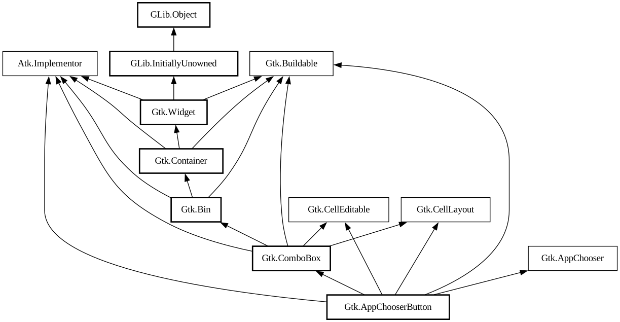
public class AppChooserButton : ComboBox, Implementor, AppChooser, Buildable, CellEditable, CellLayout
AppChooserButton
Object Hierarchy:
Description:
The `GtkAppChooserButton` lets the user select an application.
Note:
The application selection widgets should be implemented according to the design of each platform and/or application requiring them.
<picture> <source srcset="appchooserbutton-dark.png" media="(prefers-color-scheme: dark)"> <img alt="An example GtkAppChooserButton" src="appchooserbutton.png"> </picture>
Initially, a `GtkAppChooserButton` selects the first application in its list, which will either be the most-recently used application or, if [property@Gtk.AppChooserButton:show-default-item] is true, the default application.
The list of applications shown in a `GtkAppChooserButton` includes the recommended applications for the given content type. When [ property@Gtk.AppChooserButton:show-default-item] is set, the default application is also included. To let the user chooser other applications, you can set the [property@Gtk.AppChooserButton:show-dialog-item] property, which allows to open a full [ class@Gtk.AppChooserDialog].
It is possible to add custom items to the list, using [method@Gtk.AppChooserButton.append_custom_item]. These items cause the [
signal@Gtk.AppChooserButton:GtkAppChooserButton:custom-item-activated] signal to be emitted when they are selected.
To track changes in the selected application, use the [signal@Gtk.AppChooserButton:GtkAppChooserButton:changed] signal.
CSS nodes
`GtkAppChooserButton` has a single CSS node with the name “appchooserbutton”.
Namespace: Gtk
Package: gtk+-3.0
Content:
Properties:
Creation methods:
Methods:
Signals:
Inherited Members:
All known members inherited from class Gtk.ComboBox
All known members inherited from class Gtk.Bin
All known members inherited from class Gtk.Container
All known members inherited from class Gtk.Widget
All known members inherited from class GLib.Object
All known members inherited from interface Atk.Implementor
All known members inherited from interface Gtk.AppChooser
All known members inherited from interface Gtk.Buildable
All known members inherited from interface Gtk.CellEditable
All known members inherited from interface Gtk.CellLayout